
Why Your Multi-Column Dubsado Form Fields Stack Weirdly on Mobile (And How to Fix It)

Have you ever filled out a form on your phone, and everything just felt... clunky? Maybe text was out of order, fields were misaligned, or it felt like a puzzle just to get through it. As a business owner, that’s not the impression you want to leave.
Design and layout may seem like small details, but when a form doesn’t look right—especially on mobile—it can feel unprofessional. Worse, it creates friction in your client’s journey. And the truth is, most clients won’t say anything. They’ll just feel it.
Getting your forms to display cleanly isn’t about vanity—it’s about creating a seamless, intuitive, and premium experience that reflects the quality of your brand. Especially if you’re using a CRM like Dubsado to automate the experience, the form design should feel just as polished as your services.

Let’s break down how container structure affects mobile display—and how to get it right.
How Dubsado Mobile Stacks Columns
Dubsado forms are responsive — which means your beautiful two-column layouts will automatically adjust for mobile devices. On smaller screens, content inside containers stacks vertically so everything stays readable and user-friendly.
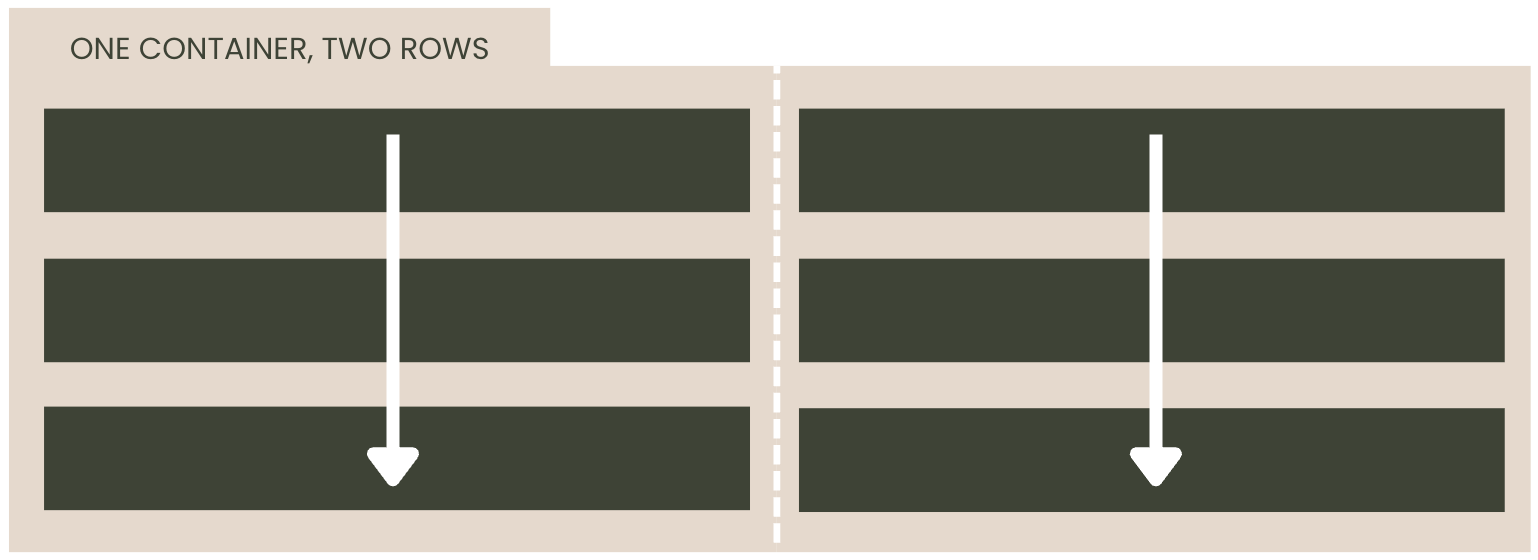
But there's a catch: Dubsado stacks by column, not by row. So if you’re building a form with multiple fields in rows and columns, the order you build it in matters.
This means, if all your fields are in one container—regardless of row separation— they will stack out of order.

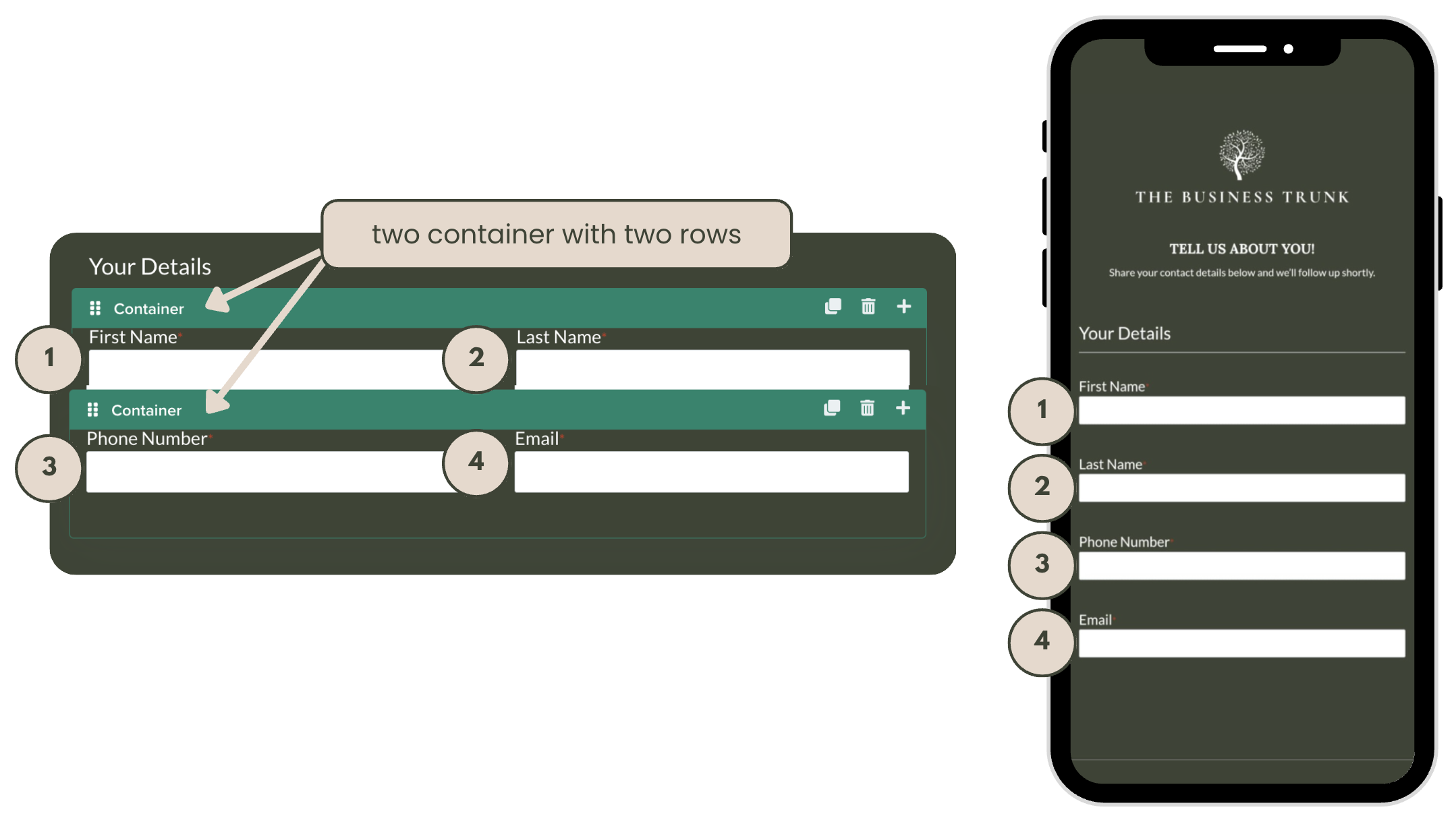
The Fix: One Container per Row

The solution, is to create a new container per row. Dubsado will then stack the fields by container and, since there is only one row, it will read it left to right.
This will still give the correct results no matter how many rows you have. Example, if you do one container with two rows and another container with three rows, it will still stack in the correct order.

When Column-Based Stacking Is the Right Choice
While most intake forms should stack row by row on mobile (so the fields read naturally top to bottom), there are a few situations where stacking column by column is actually more effective — and intentional.
Here are a few examples where that layout might be exactly what you want:
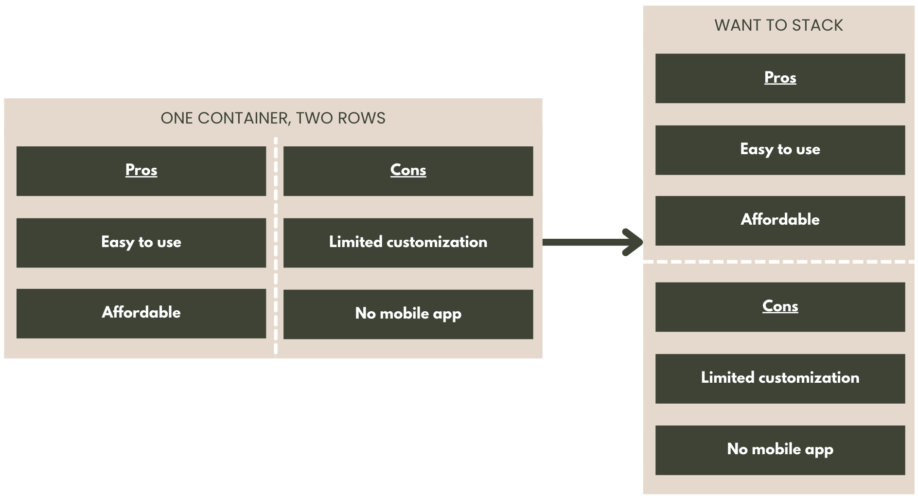
Side-by-Side Comparisons
If you're comparing two lists — like "Pros vs. Cons" or "Before vs. After" — keeping each column together on mobile makes more sense. You wouldn’t want those points to get mixed or interleaved. Instead, you want users to read through one full list before starting the next.

service or Pricing Options
When you're presenting multiple packages or offerings side by side, stacking column by column allows each option to appear in full before the next one. This keeps all the details for one package grouped together, making it easier for clients to compare.
So while column stacking usually causes headaches on mobile forms, there are cases where it can enhance clarity and client experience. The key is being intentional about it — and testing how it behaves across screen sizes.
